
In this kitchen project in Bahçelievler, Istanbul, we brought together AGT Supramat surfaces, natural wood veneer, an imported porcelain worktop and a solid wood counter for the coffee corner. At 2EM Interior Architecture & Furniture, when choosing the materials we looked beyond colour harmony at where each surface would be used, its texture and how it relates to the space as a whole.
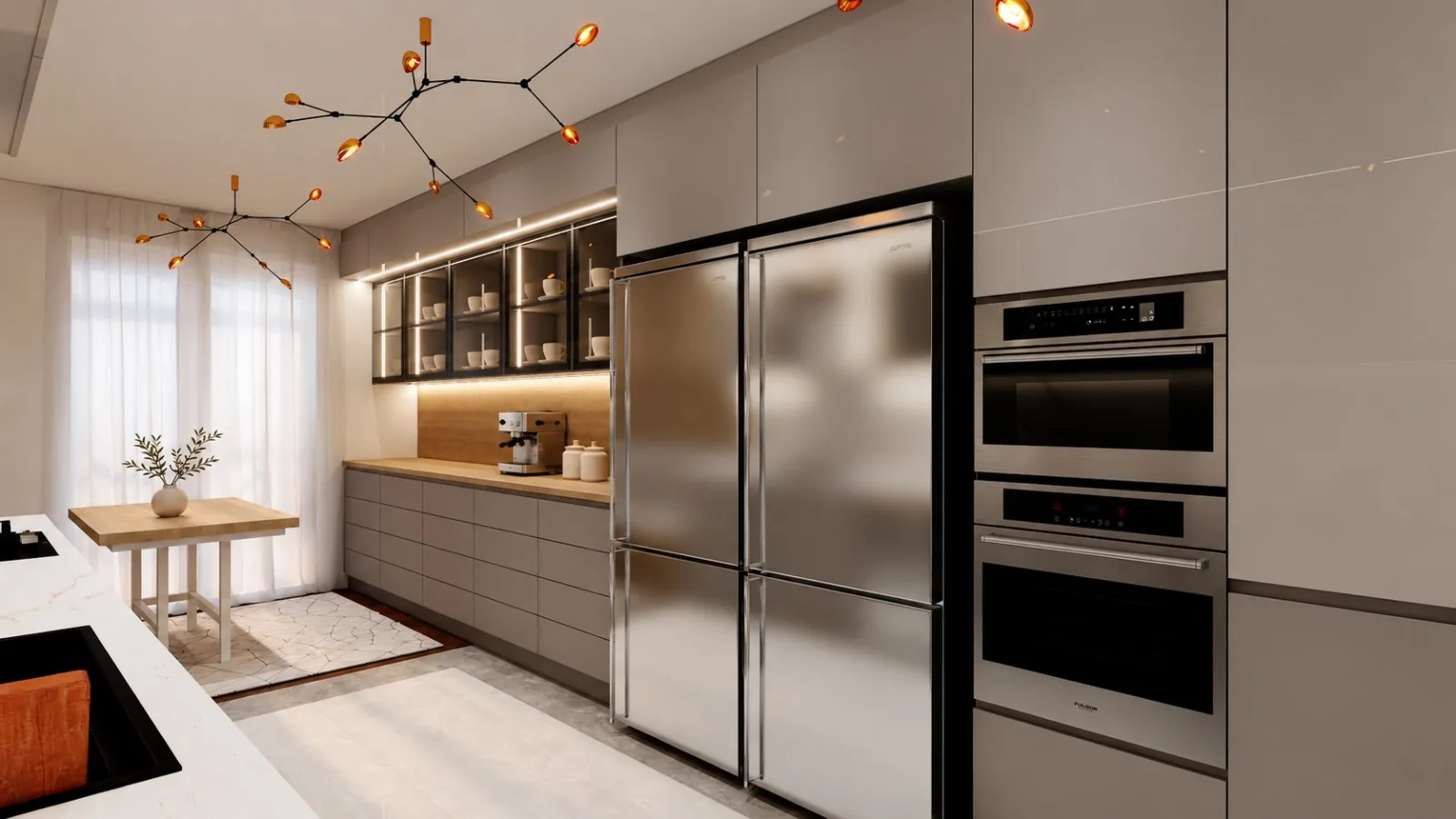
In this project the calm look of greige tones is completed by the warm colour shifts of the wood. The light, veined main worktop defines the working area of the kitchen, while the solid wood coffee counter creates a warmer area for preparing and serving. The glass-fronted cabinets and the dining nook continue this combination of materials.
For anyone thinking of having a made-to-measure kitchen built in Bahçelievler, this project shows what different materials can be used together for. In this article we explain both the visual language of the design and the properties of the materials we chose, along with the points to watch when caring for them.
Materials used in the project
| Material | Use in the project and contribution to the design |
|---|---|
| AGT Supramat | A matt surface effect and a simple, unified colour on the kitchen furniture |
| Natural wood veneer | Real grain and natural tonal variation on the wood surfaces |
| Imported porcelain worktop | A light, veined surface for the main kitchen working area |
| Solid wood counter | A warm, natural and tactile surface in the coffee corner |
| Glass-fronted cabinets | Storage that displays the cups and adds visual depth |
The design approach of the Bahçelievler kitchen project
The character of a kitchen is shaped as much by how neighbouring surfaces complete each other as by the colour of the doors. In this project we treated the large cabinet surfaces in greige tones. This colour family, sitting between grey and beige, provides a visual transition between the light worktop and the warm wood.
Two different zones of use can be read in the visuals. The main worktop, together with the sink and hob, forms the everyday preparation area. On the opposite side, the coffee-making area, the glass-fronted wall cabinets and the tall cabinet run come together. The seating nook near the window turns the kitchen from a place for preparing food into a living space where time is spent.
When evaluating kitchen planning in interior architecture projects in Bahçelievler, the dimensions of the existing space, the daylight, the placement of appliances and the habits of the users should be considered together. The same choice of materials may not give the same result in a different layout. For this reason a made-to-measure kitchen design should be approached as a whole, beyond picking a colour from a materials catalogue.
What is AGT Supramat and what effect does it create in a kitchen
AGT Supramat is a series of MDF-based decorative furniture panels. The manufacturer describes the collection by its matt lacquer feel, silky touch and resistance to scratching and fingerprints. The low light reflection of the matt surface allows furniture designs in which gloss is not dominant. These properties do not mean the product will never scratch or will never show marks under any conditions.
The effect we wanted to achieve by using AGT Supramat in the project was for the large cabinet surfaces to form a calm backdrop to the space. When the greige tones meet the frames of the glass doors and the wood surfaces, they tie the different parts of the kitchen together. This way the cabinets, the worktop and the coffee corner do not look disconnected.
The choice of a matt surface particularly helps to balance the variety of materials in this project. With grain movement in the wood, fine patterns in the porcelain and reflections in the glass, the plainer look of the doors keeps the eye from meeting a separate intensity on every surface. This is a design relationship that can be read from the visuals; it does not mean the product will always appear in the same tone under a given light.
Application and care of Supramat surfaces
When evaluating an AGT Supramat kitchen cabinet, the edge finishes, the joints and the installation workmanship matter as much as the choice of panel. The manufacturer's edge banding options matched to the collection support the visual unity of surface and edge.
For daily cleaning, the manufacturer's current care instructions should be followed. Cleaning the surface and protecting the joints should be thought about together; surface resistance should not be read as unlimited water or heat resistance for the whole cabinet. Seeing the material sample in the real lighting of the kitchen in particular helps to make a sounder colour decision.
The texture natural wood veneer brings to the space
Natural wood veneer is made by applying a thin layer of wood obtained from a real tree to a suitable carrier surface. It is therefore not just a pattern that gives the look of wood; its surface carries the grain and natural colour differences of real wood. The look of the veneer varies with the tree species, the way it is cut, the arrangement of the leaves and the surface finish.
In this kitchen the presence of natural wood veneer gives the plain-coloured cabinets a warmer companion. In the visuals, the wood surface behind the dining nook and the wood look in the coffee section repeat the same colour family at two separate points in the space. Thanks to this repetition a visual link is formed between the dining area and the kitchen furniture.
The framed division of the vertical wood surface in the dining nook gives rhythm to a flat wall. The grain of the wood continues its natural movement within this geometric order. Seen together with the upholstered seating, the light-coloured table legs and the sheer curtains, a softer language for the space emerges.
Grain direction and surface finish in wood
In natural veneer, the grain direction of adjacent pieces affects the unity of the design. Vertical grain can be used to emphasise height, horizontal grain to create continuity along a surface. What matters here is that the direction of the pattern is considered together with the design before application.
Natural wood is not expected to look exactly the same in every piece. Controlled differences in tone are part of the character of the material. The surface you feel when you touch it depends not only on the wood itself but also on the protective finish used. For this reason, when choosing a natural veneer it is useful to see a sample of the finished surface as well as the colour sample.
The role of the imported porcelain worktop in the kitchen
In the project we used an imported porcelain worktop for the main working surface. In the visuals, the fine warm-toned veins running across a light ground form a colour link between the greige cabinets and the wood. The light colour of the worktop helps the working area to read more clearly, set apart from the cabinets.
When choosing a porcelain worktop, the effect across the whole space should be evaluated as much as the close-up look of the pattern. Very dense veining can increase visual movement in a small area; sparser patterns can leave room for the other materials. In this project, because the wood grain already has a strong character, the light worktop surface forms the calmer part of the composition.
The front edge of the worktop, the corner returns and the finishes around the appliances also affect the result. How a pattern liked on a sample will spread over a large surface should, as far as possible, be evaluated on the slab before application. Deciding by looking only at the colour of the porcelain can lead to important details such as the placement of the veins and the look of the edge being overlooked.
Durability and use of porcelain worktops
For porcelain worktops, daily care and durability values should be assessed for the product chosen. For example, the porcelain surface manufacturer Caesarstone emphasises scratch resistance in its own products while asking that exposed edges in particular be protected from hard impacts. This example shows that even a durable surface needs correct use; it does not indicate the brand of the porcelain used in the project.
For this reason, when evaluating a porcelain worktop, the brand, series, thickness, surface finish and the manufacturer's conditions of use should be taken into account in addition to the description "imported". In daily use, using a chopping board and a trivet, not knocking heavy utensils against the edges and choosing the cleaning product according to the surface's care guide is a protective approach.
A solid wood counter in the coffee corner
By using a solid wood counter in the coffee corner we created a material experience different from the main working area. Used together with the coffee machine, cups and serving ware, this surface becomes a warmer focal point of the kitchen.
Solid wood and natural wood veneer do not have the same structure. In natural veneer a thin layer of real wood is applied to a carrier surface. In a solid wood counter the wood forms the body of the material; the product can also be made from joined solid pieces. The word "solid" on its own does not show that the counter is made from a single piece of tree.
This difference matters for explaining what the material will be used for. While natural veneer carries the look of wood across wide furniture surfaces, the solid counter forms the surface you touch directly when making coffee. This way, in the same kitchen, wood does not remain only a decorative element; it also becomes part of the experience of use.
In the visuals, the horizontal line of the coffee counter reads together with the glass-fronted cabinets above. While the plain arrangement of the base cabinets leaves room for the grain of the wood, the light colour of the cups stands out against the warm tones of the counter. The space left around the coffee machine also helps the surface stay visible.
Care of the solid wood coffee counter
The care method for a solid counter is determined by the surface protection applied. Oiled finishes and film-forming finishes do not have the same care needs. For this reason it cannot be said that every solid counter needs oiling at the same frequency; the system recommended by the manufacturer and the installer should be followed.
In the coffee corner, wiping up liquids spilled while filling the water tank or placing cups without leaving them to sit, using a protector under hot items and keeping the area around the machine dry are sensible habits. How the wood surface looks over time is related to the way it is used as much as to its protective finish.
The effect of glass-fronted cabinets and lighting on the materials
The glass-fronted wall cabinets have a prominent place in the coffee corner design of this project. The light-coloured cups seen against the darker cabinet interiors give depth to the storage area. The glass surfaces create a visual openness between the wide, closed cabinet volumes.
The vertical lines of light inside the cabinets bring out the objects on the shelves and the boundaries of the modules. The lighting over the counter makes the tonal shifts of the wood surface more visible. The light, veined surface seen from the other angle offers a different material character under the light. This way matt, transparent, veined and wood surfaces can each be read separately in the same kitchen.
The effect of lighting should not be overlooked when choosing materials. A greige door can be perceived differently under warm artificial light and in daylight. The tone of the wood and how pronounced the porcelain veins are can also change with the light. This is why it is worth making the final choices, as far as possible, from samples placed side by side in the same setting.
Evaluating the materials together
The four main materials in this project were not chosen to be used in place of one another; each answers a different surface need. AGT Supramat creates the plain look of the cabinets, natural wood veneer the grain character of the wide surfaces, porcelain the light, veined effect of the main worktop, and solid wood the warm contact surface in the coffee area.
In made-to-measure kitchen production it is important to establish this relationship at the drawing stage. The proportions of the cabinets, the door divisions, the line of the worktop, the appliance openings and the placement of the glazed areas should be considered together. Material quality is only fully reflected in the design within an application that agrees with these details.
For users who want a similar approach when renovating a kitchen in Bahçelievler, the starting point is to define the needs. Once it is clear whether more storage, a separate coffee-making area or a seating nook within the kitchen is needed, the material decisions also become more meaningful.
Frequently asked questions
Made-to-measure kitchen and coffee corner design in Bahçelievler
In this project in Bahçelievler, at 2EM Interior Architecture & Furniture we handled the choice of materials, the furniture design and the needs of daily use together. With AGT Supramat, natural wood veneer, imported porcelain and solid wood we created a kitchen design in which different textures sit in balance.
For made-to-measure kitchen cabinets, kitchen renovation or coffee corner design in Bahçelievler and across Istanbul, you can get in touch with us. We can assess the dimensions of your space, your expectations of use and your material preferences together and develop a design that suits you.